The Gensler Project that Steals the NYC Skyline
The Passion
I love the incredibly well-executed spaces and passion that Gensler brings to all their projects. The thought as to how the space will be used, materials chosen, the various types of environments to collaborate, and the constant evolution of how the workplace engages me. Senior Designer Edward Wood has provided wonderful opportunities for me to grow and collaborate together on their projects up and down the Eastern United States. This one is my new favorite.
The Sophistication
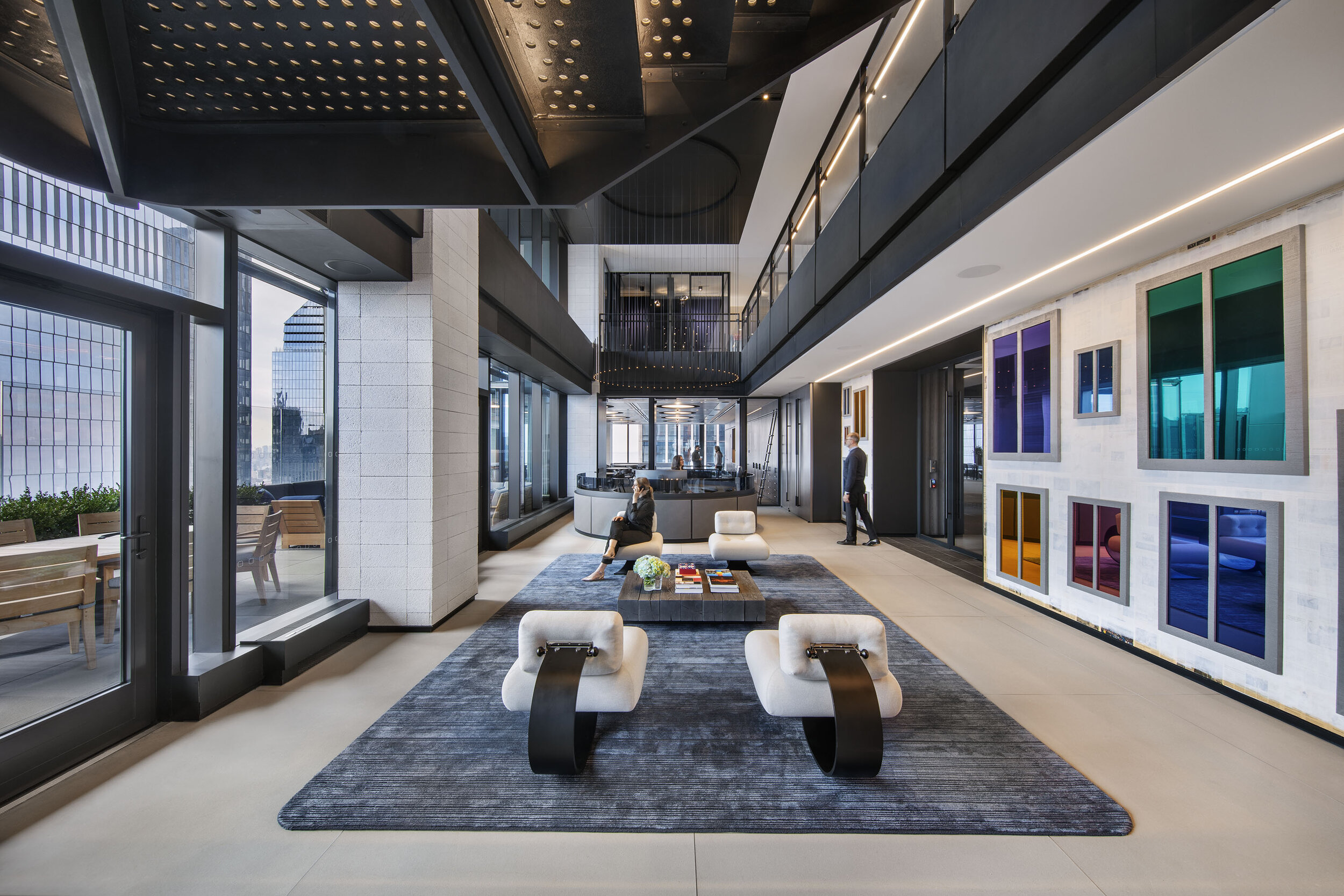
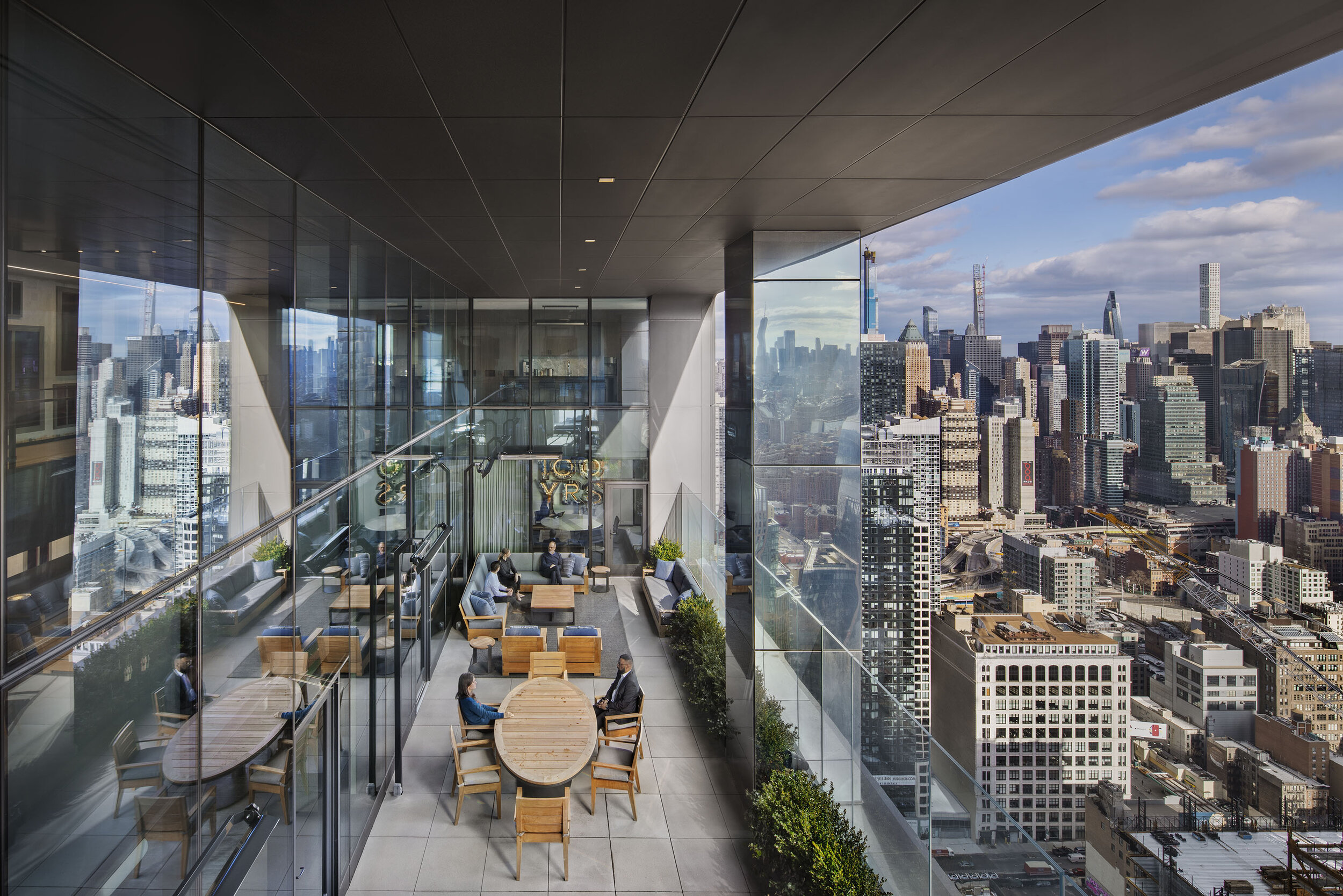
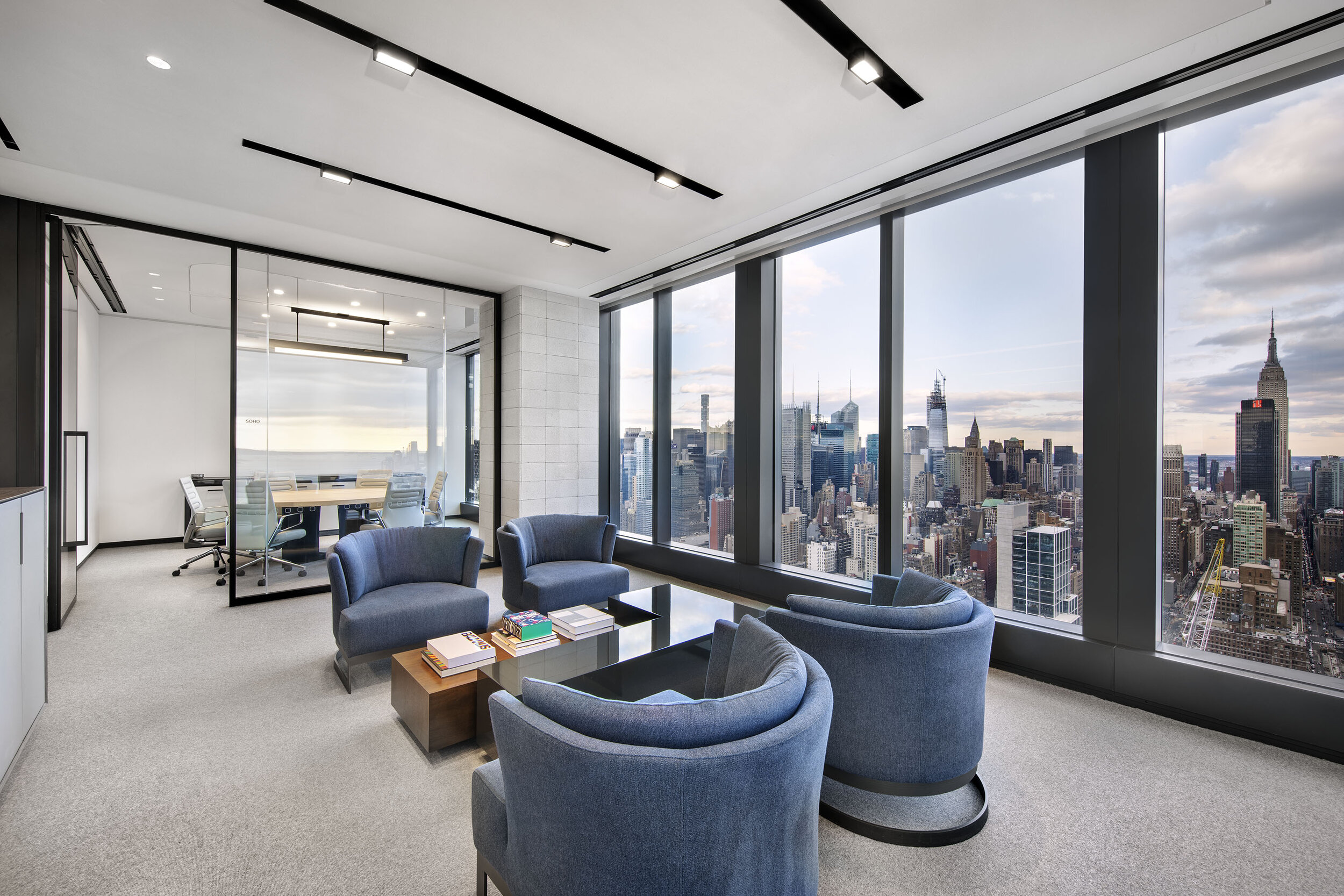
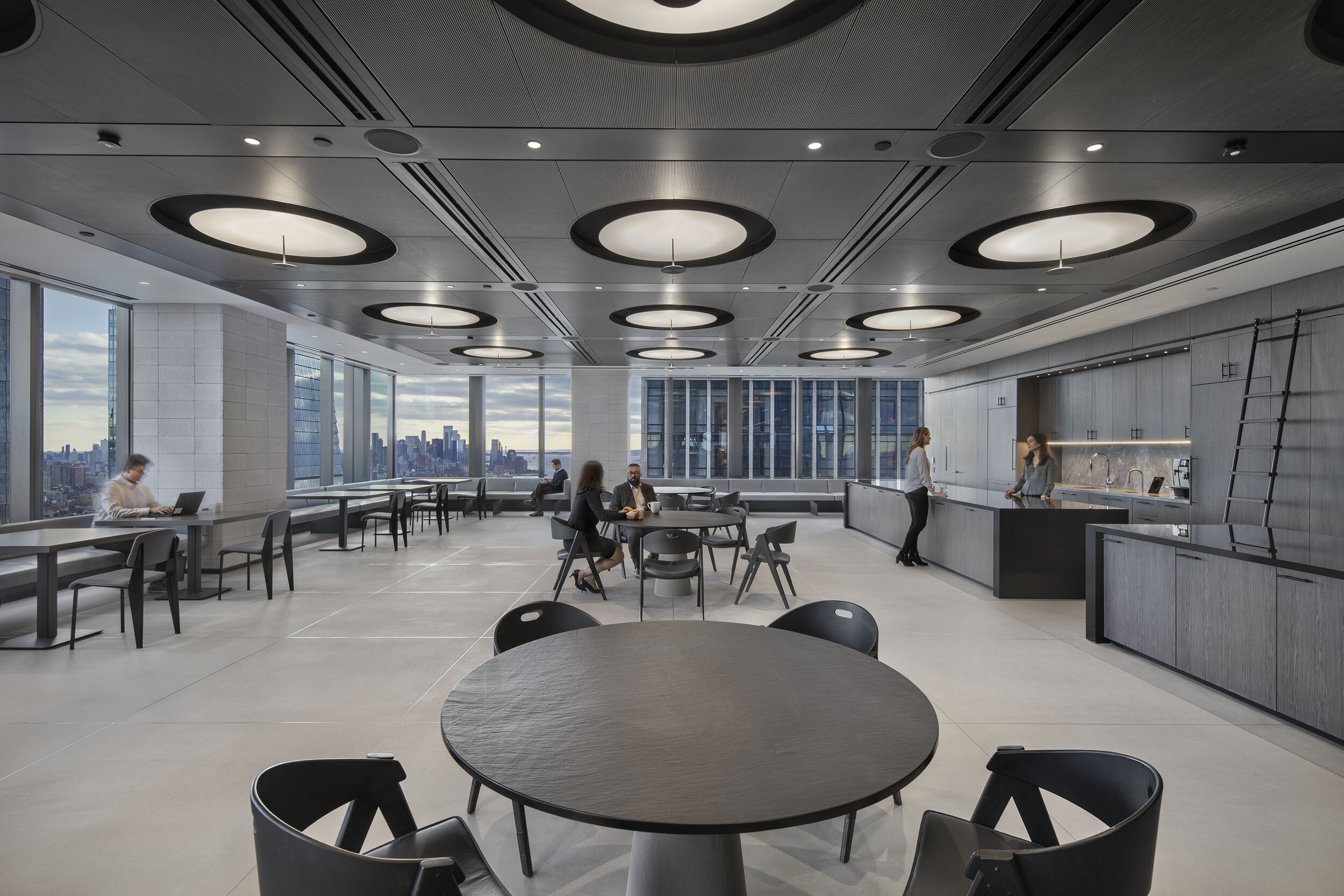
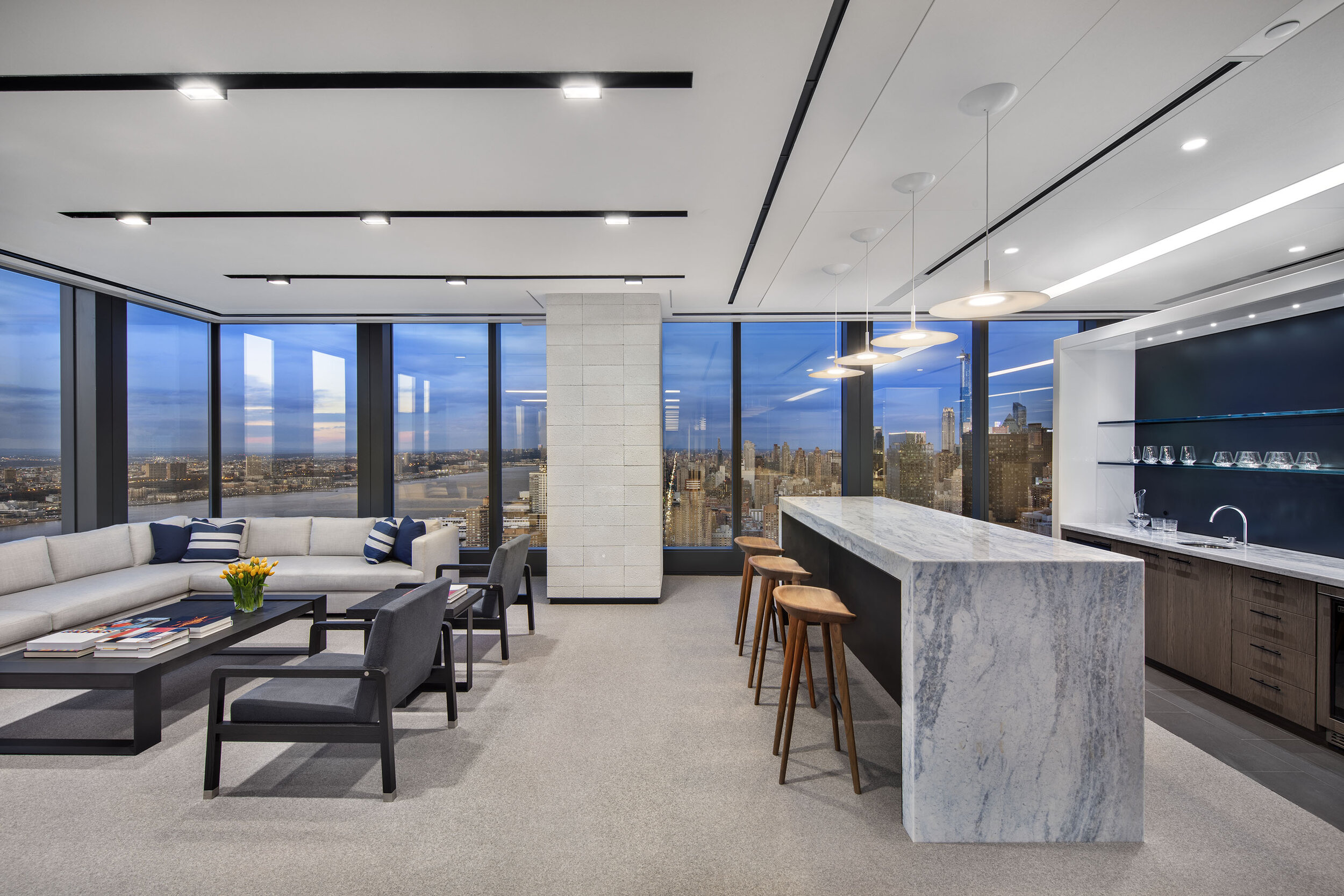
I have photographed airports, luxury homes and hotels, iron chef restaurants, one of a kind retail environments and even the New York Stock Exchange, but this project in the new Hudson Yards development left me speechless. The double-height space explores the upper limit of bespoke office in 2020. With it’s sophisticated palate and minimalistic materials, it is the perfect combination to encourage free thinking and collaboration. The relationship of the offices to the New York City skyline was explored through the use of low cubicle areas and the maximization of the floor to ceiling glass panels. The client even opted for an outdoor patio to fully embrace the city and provide a unique experience for themselves and their clients.
Gensler - Hudson Yards - NYC
The double-height entry with access to the outside and flawless metalwork on the internal staircase is a jaw-dropper. The elaborate art installation covers and embraces both floors with a flash of color in contrast to the nearly black and white duality of the material of the office. In order to make our images match the one of the rendering we needed to remove and reset the furniture and custom area rug in front of the reception desk to insure that it was perfectly symmetrical in my image. Working for the highest-end clients, it is the little things like this and getting all the wheels of chairs in conference rooms to face the same way that separates the professional from the amateur photographer.
Best in Class
One of the greatest assets of working with passionate firms is that they bring people, props, and enthusiasm to the photoshoot. While a shot list is great, having people and flexibility really helps us get close to perfection. While designers may want people in their images, we offer to do it with or without people so they can decide later what works best for their marketing needs. Sometimes the designer and the marketing people are not on the same page and this keeps us moving to make everyone happy. In this case, Gensler brought seven people from their New York office to help illustrate how space could be used and inhabited.
Trying to accomplish 12-16 images in one day, including two dusk shots and people, requires a lot of choreography and pace. We started in the hardest space, which was the lobby, and then moved with the sun to ensure that all the images felt like they had the same amount of natural light flooding into them. Once that was done we changed the scale of the images to smaller gathering areas and finally to a few smaller offices and some tiny details. At the end of the shoot, we had two cameras set up so we could capture one dusk shot looking south toward the Empire State Building and the other looking north up the Hudson River. The play of warm and cool of the daytime images was replaced by the deep blues of dusk and sunset.
Post Production Glory
The post-production was incredibly complex, as is always the case with the best work. In our basic post-production work, we do color correction, compositing of the view, and removal of exit signs and air ducts that would detract from the designer’s original intent. Ben Diep from Color Space Imaging and I went over all the images and corrections that were included on a mark up from the marketing team at Gensler. It takes about an hour for an image to do post-production at this level, which means it can take about three business days before we can completely turn the job around. This is one of the things that separates my work from other photographers is the attention to detail of the final images, as we have to ensure that all 16 images work well together almost like a visual family. This is why we start early and chase the sun throughout the day until it sets.
There were some things that were beyond our normal scope and so we presented those items and a cost to make it look even more perfect. We also tend to do a lot of clean up of drywall ceilings, baseboards, and places where materials meet, but this project really pushed us on how to best resolve the issues for this shoot and have it trickle down and across to our other valued clients. The ability to actually turn my images into rendering for the architects is really the next step in my evolution and the services I can offer to them. While the price makes photography more expensive, it’s still much less expensive than the client commissioning a rendering on their own. This level also requires more coordination between the client, myself, and the post-production team.
